Heuristic Evaluation Deep Dive: Systematic UX Inspection Without Users

Heuristic evaluation is a usability inspection method where evaluators examine an interface and judge its compliance against recognized usability principles — heuristics. No users required. No lab equipment. Just trained evaluators and a systematic framework.
Jakob Nielsen and Rolf Molich developed it in 1990. It remains one of the most cost-effective methods for finding usability problems early.
The Core Value Proposition
Heuristic evaluation finds problems before you recruit users. A 1-hour heuristic evaluation can identify 35–50% of an interface's usability problems — without a single user session.
The method works because most usability problems violate well-understood principles. "No error recovery path" violates heuristic 9. "Inconsistent button placement" violates heuristic 4. Trained evaluators can spot these without watching users struggle.
Where heuristic evaluation doesn't replace user testing:
- It misses problems caused by real user context (language, mental models, domain knowledge)
- It can over-flag false positives (experts notice things users navigate around)
- It can't measure task success rates or time-on-task
Use HE early to catch obvious problems cheaply. Use user testing to validate what's left.
Nielsen's 10 Heuristics
Jakob Nielsen's 10 usability heuristics, first published in 1994, remain the dominant framework:
H1: Visibility of system status The system should always keep users informed about what is going on through appropriate feedback within reasonable time.
Bad: File upload progress bar doesn't update. User doesn't know if the upload is running or frozen. Good: Upload shows percentage completion with estimated time remaining.
H2: Match between system and the real world The system should speak the users' language, with words, phrases, and concepts familiar to the user. Follow real-world conventions.
Bad: "Initiate data persistence operation" instead of "Save" Good: Icons and terminology that match users' domain knowledge
H3: User control and freedom Users often choose system functions by mistake. Clearly marked "emergency exits" to leave the unwanted state without having to go through an extended dialogue.
Bad: No undo on destructive actions. Confirming a delete immediately deletes. Good: Undo available for 5 seconds after delete. Trash bin with restore capability.
H4: Consistency and standards Users should not have to wonder whether different words, situations, or actions mean the same thing.
Bad: "Submit" on one form, "Save" on another, "Confirm" on a third — for the same action. Good: Same action = same label everywhere.
H5: Error prevention Even better than good error messages is a careful design that prevents a problem from occurring in the first place.
Bad: Date input accepts any text, only fails on submit. Good: Date picker prevents invalid date selection.
H6: Recognition over recall Minimize the user's memory load. The user should not have to remember information from one part of the dialogue to another.
Bad: Checkout requires user to remember their account email to verify purchase. Good: Display email with option to change; pre-fill known information.
H7: Flexibility and efficiency of use Accelerators — unseen by the novice user — may often speed up interaction for the expert user.
Bad: Power users must use the same 5-step wizard as first-time users every time. Good: Keyboard shortcuts, saved settings, bulk operations for frequent users.
H8: Aesthetic and minimalist design Dialogues should not contain irrelevant or rarely needed information.
Bad: Dashboard with 20 widgets, most showing irrelevant metrics. Good: Default to 4–6 most relevant metrics, with option to add more.
H9: Help users recognize, diagnose, and recover from errors Error messages should be expressed in plain language, precisely indicate the problem, and constructively suggest a solution.
Bad: "Error 4023" with no explanation. Good: "That email is already registered. Sign in or reset your password."
H10: Help and documentation Even though it is better if the system can be used without documentation, it may be necessary to provide help.
Bad: No inline help, documentation is a PDF that users must leave the app to read. Good: Contextual tooltips, inline documentation, searchable help.
Severity Rating Scale
Each violation gets a severity score. Nielsen's 0–4 scale:
0 — Not a usability problem: The evaluator disagrees on reflection. Not worth fixing.
1 — Cosmetic problem: Only needs to be fixed if time permits. Users notice but navigate around it.
2 — Minor usability problem: Low priority to fix. Causes some confusion but users recover.
3 — Major usability problem: Important to fix. Users have trouble but can eventually succeed.
4 — Usability catastrophe: Imperative to fix before product ships. Users cannot complete the task.
Score each violation independently. When aggregating across evaluators, average the scores. Problems that multiple evaluators rate 3–4 are your critical findings.
The Evaluation Protocol
Preparation
- Define the scope: which screens, flows, or features to evaluate?
- Define the user persona: who are the target users?
- Select heuristics: Nielsen's 10 is the default, but domain-specific heuristics may apply
- Brief evaluators: they should know the product context but not be trained to defend it
Running the evaluation
Each evaluator inspects the interface independently. Two passes recommended:
Pass 1 — Overview: Walk through the main flows without noting violations. Build context.
Pass 2 — Systematic inspection: Go through each flow while actively checking against each heuristic. Note every violation.
For each violation, record:
- Location (screen, component, interaction)
- Heuristic violated (H1–H10)
- Description of the problem
- Severity rating (0–4)
- Suggested fix (optional but helpful)
Session length
Plan 1–2 hours per evaluator per major flow. Complex systems may need 4+ hours for full coverage. Break long evaluations into sessions.
How Many Evaluators?
Nielsen's research shows a single evaluator finds ~35% of usability problems. Three evaluators find ~60%. Five evaluators find ~75%.
Diminishing returns kick in around 5 evaluators. Above that, you're spending a lot for marginal gains.
Practical guidance:
- Quick review (pre-launch sanity check): 2–3 evaluators
- Standard HE: 3–5 evaluators
- High-stakes system (medical, financial, accessibility-critical): 5+ evaluators with domain expertise
The evaluator independence is critical. Evaluators should not discuss findings until they've completed their independent evaluation. Group bias degrades the results.
Aggregating Results
After individual evaluations, aggregate findings:
- Combine all violations into a single list (use a spreadsheet)
- Deduplicate: different evaluators often identify the same violation
- For duplicates, average severity scores
- Sort by averaged severity
- Note agreement: violations that multiple evaluators independently flagged are higher confidence
The output: a ranked list of usability violations with severity scores and evaluator agreement levels.
Prioritization matrix:
| Severity 4 | Fix before launch (P0) |
|---|---|
| Severity 3 | Fix in next sprint (P1) |
| Severity 2 | Fix in upcoming milestone (P2) |
| Severity 1 | Fix if time permits (P3) |
| Severity 0 | Discard |
Evaluator Profiles
Who should conduct heuristic evaluations?
UX specialists: Highest quality findings. Familiar with heuristics and interaction patterns. Expensive and often scarce.
QA testers with UX training: Good quality. Most QA teams can develop this skill. Underused resource.
Developers: Lower quality without UX background, but valuable for feasibility checking. Better than nothing.
Domain experts (non-designers): Excellent for H2 (match with real world) and H6 (recognition over recall). Poor for structural/interaction heuristics.
Mixed evaluator groups produce the best coverage. A UX specialist + a QA engineer + a domain expert catches more categories of problems than three UX specialists.
Domain-Specific Heuristics
Nielsen's 10 are generic. For specialized systems, add domain-specific heuristics:
Mobile applications (Hoehle & Venkatesh, 2015 extensions):
- Elegance: visual clarity, appropriate use of space
- Flow: minimal interruptions, appropriate use of notifications
- Clarity: legibility on small screens, touch target sizes
E-commerce:
- Trust signals: security badges, reviews, return policies
- Price transparency: no hidden fees surfaced at checkout
- Cart persistence: cart saved across sessions and devices
Enterprise/B2B software:
- Power user efficiency (H7 becomes critical)
- Audit trail visibility (users need to know who changed what)
- Role-based information display (show only what's relevant to the user's role)
Healthcare systems (add safety-critical heuristics):
- Error criticality: distinguish catastrophic from cosmetic errors clearly
- Confirmation for irreversible actions: double-check before anything permanent
- Data integrity visibility: make it clear when data was last updated and from where
HE in Development Cycles
Heuristic evaluation is most valuable when it's integrated into development, not added at the end.
Wireframe stage: Evaluate before implementation. Fixes are cheap — it's just a design change.
Pre-development review: Evaluate detailed mockups before developers start. Catch H5 (error prevention) and H3 (user control) issues before they're coded.
Pre-user testing: Run HE before recruiting users. Fix obvious violations so user testing sessions focus on deeper insights.
Post-launch audit: Periodic HE on live product. Track whether violations are being addressed over time.
The worst time to do HE: right before launch, when there's no time to fix anything above P0.
Common Evaluation Mistakes
Evaluating without a user persona in mind: H2 and H6 violations depend heavily on who the users are. "Jargon" for an expert audience is appropriate terminology. Know your users.
Severity inflation: Evaluators overrate severity because they're focusing on the violation, not the user impact. Ask: "Would a real user be unable to complete their task because of this?" before rating 4.
Missing flows: Only evaluating the happy path. Error states, edge cases, and administrative flows contain most serious H9 violations.
Single evaluator: One evaluator's mental model dominates. Use at least 2–3 for anything consequential.
Not documenting location precisely: "The save button" is not enough. "Save button on the project settings screen, under the Advanced tab" is actionable.
Ignoring H8: Evaluators are experts. They rarely flag aesthetic minimalism violations because they navigate cluttered interfaces easily. Ask a fresh pair of eyes to check H8 specifically.
Combining HE with Other Methods
HE + cognitive walkthrough: HE finds heuristic violations; cognitive walkthrough follows user goals step by step to find workflow gaps. Together they cover interaction design systematically.
HE + user testing: Run HE first, fix P0–P1 findings, then run user testing. User testing time is precious — don't waste it on problems you could catch with HE.
HE + analytics: Use analytics to identify which flows to prioritize for evaluation. High drop-off flows deserve more evaluator attention.
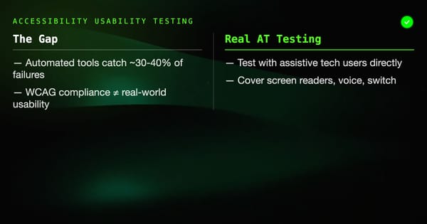
HE + automated accessibility testing: Automated tools catch WCAG violations HE evaluators often miss. Run both.
Summary
Heuristic evaluation is the fastest way to find usability problems before users see them. Three to five trained evaluators, two hours each, produces a prioritized list of violations that can guide months of design improvements.
The key disciplines: independent evaluation before aggregation, honest severity scoring, full-flow coverage including error states, and integration into the development cycle rather than post-launch audits.
Use it early and often. It's too cheap not to.